What’s the good of using filters if your people are not aware of them? As per your feedback, the Display.Church team has added two design elements to make your filters clearer and more accessible.

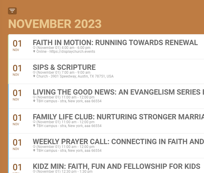
Here is part of a Cards (List) calendar view. Notice the box with the lines in the top, left-hand corner? Even if your people do, who knows what it is!
New Item #1: Toggle Filters Switch label
This box is the Toggle Filters Switch. If your people click on it, they will see all the filters you chose in the Setup tab. This will help them further filter the calendar view to see only the events which are of particular interest to them.
Let’s let them know that. Toggle on Show label next to filters button and customize the text as desired.

New Item #2: Show the filters automatically
If you want to make it even clearer, opt to use the Expand filters by default instead. Toggle on this option and your calendar viewers will automatically see the filters you chose in Setup – no need to toggle on the switch. They can then click on the filter category to reveal a dropdown menu of additional filters in that category.

filtering

