Our latest fulfillment of your feedback is a new customization option.
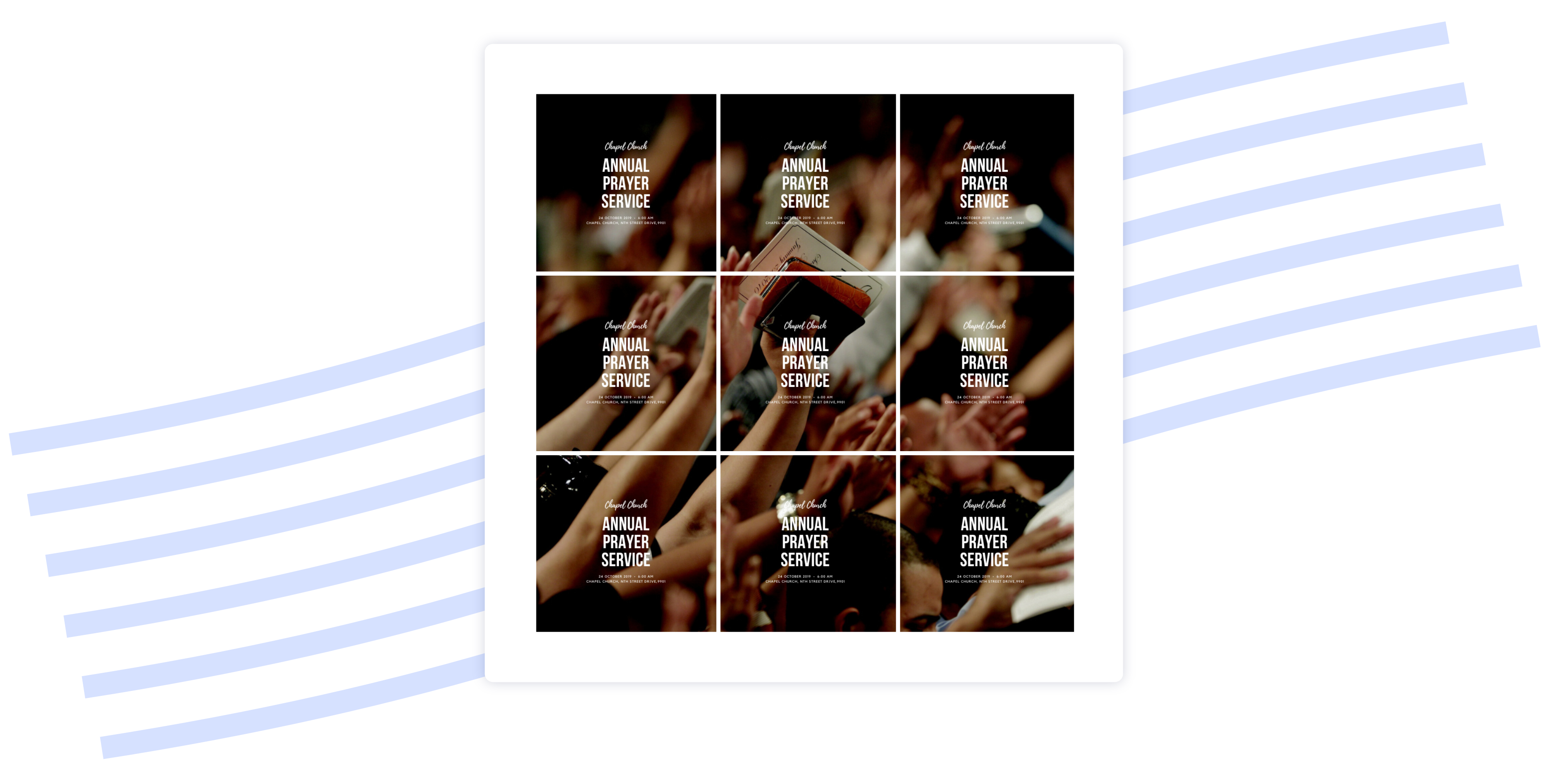
Imagine being able to showcase a group of exciting images that will motivate your people to click and find out more about the ministry events which caught their eye. In other words, no details, just images.
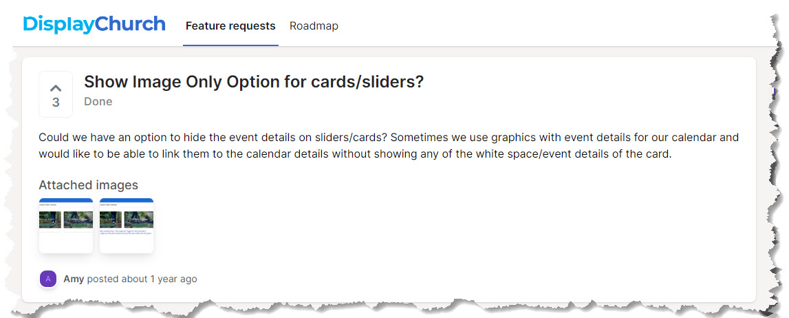
That’s what our Display.Church partner Amy was looking for. She told us: “Could we have an option to hide the event details on sliders/cards? Sometimes we use graphics with event details for our calendar and would like to be able to link them to the calendar details without showing any of the white space/event details of the card.”
Her request was upvoted by others, and we were happy to fulfill it.
CARDS (GRID) - REAL DEMO
CARDS (GRID) - REAL DEMO
CARDS (GRID) - REAL DEMO
CARDS (GRID) - REAL DEMO
SLIDER (Image Only)


CARDS (GRID) (Image Only)


It is easy to get started.
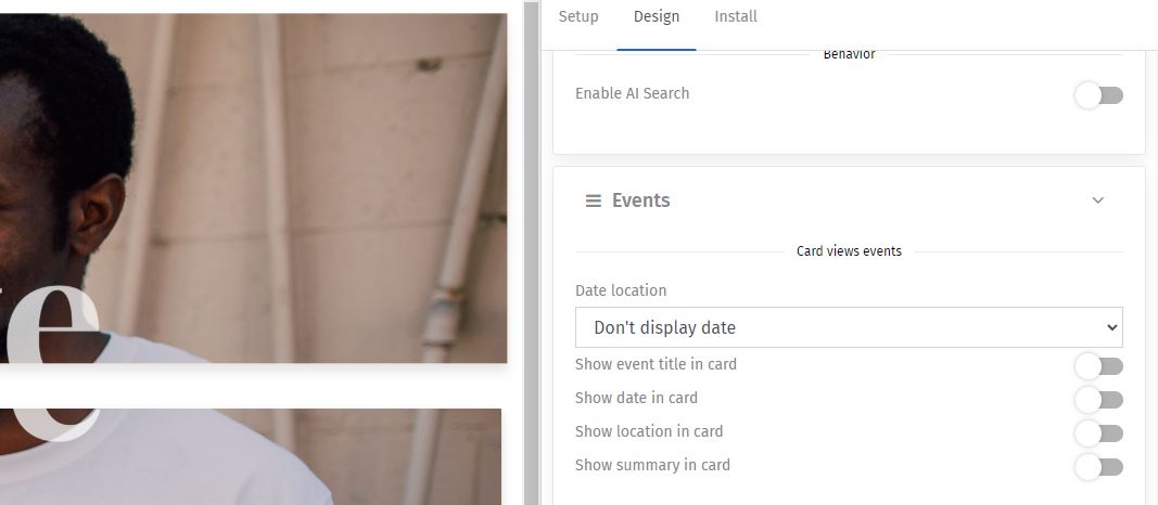
Design → Events → Card views events → Toggle off all the items in this section. (Note: Item names vary depending on your integration).
This is available in the Slider, Cards (Grid), and Cards (List) views.

Change the margins as needed.
Design → Frame and cells → Cards --> Card left and right margin + Card bottom margin
This is available in the Cards (Grid) and Cards (List) views.
By adding this customization option, you can now toggle off all the details in these main views, leaving just the pictures. By adjusting the margins, you can decrease the gaps between the pictures, allowing them to tell a more 'cohesive' story. We encourage you to explore how this idea can create unique and engaging calendar views for your church website.

