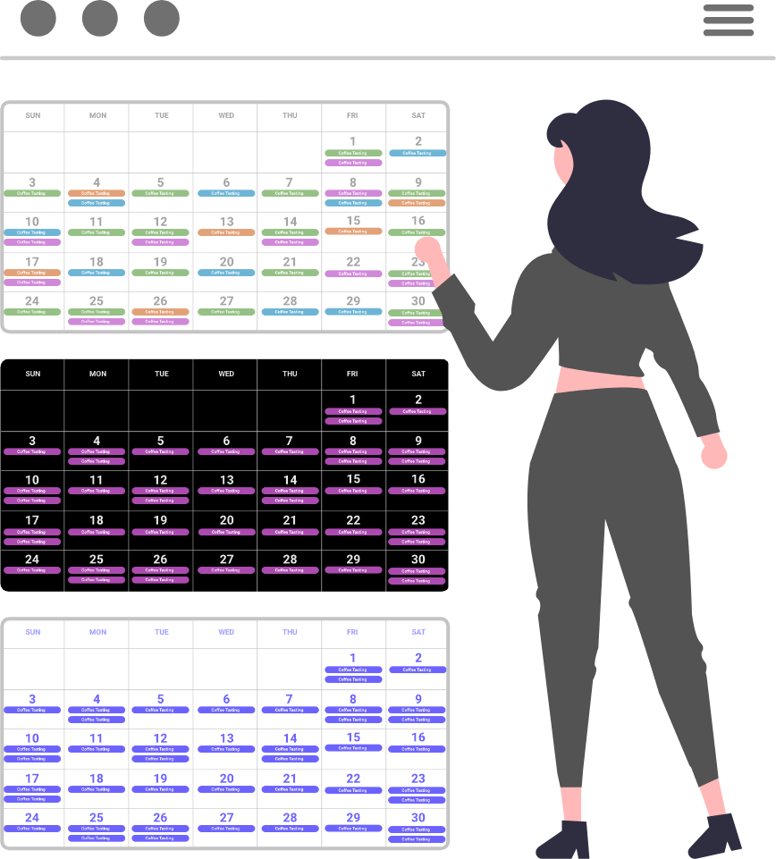
When things are too cluttered, they are not as pleasant to look at or read. Using the following design items, you can change the margins and/or padding (empty space) in many of your Display.Church widgets: Calendar views, Group widget, and Sign-up Forms widget.
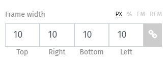
FRAME WIDTH

This design option increases or decreases the margin around the items in your calendar display. In the monthly calendar, for example, it will increase/decrease the empty space around your entire calendar view. You will also find this option when using the Groups and Sign-up Forms widgets. Read more about Frame Width here.
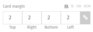
CARD MARGIN

Similar to frame width, this design option changes the margin between your displayed cards. You will find this option when using the Calendar Cards (Grid), Cards (List), and Slider views. You will also find it in Groups Cards (Grid). Read more about Card Margin here.
CARD CONTENT PADDING

Working with the Calendar Cards (Grid), Cards (List), and Slider views, this design option adds or removes padding (empty space) around the text in your card. Read more about Card content padding here.
Design, Display, margin, padding, white space

