An events calendar that feels at home at Amplify
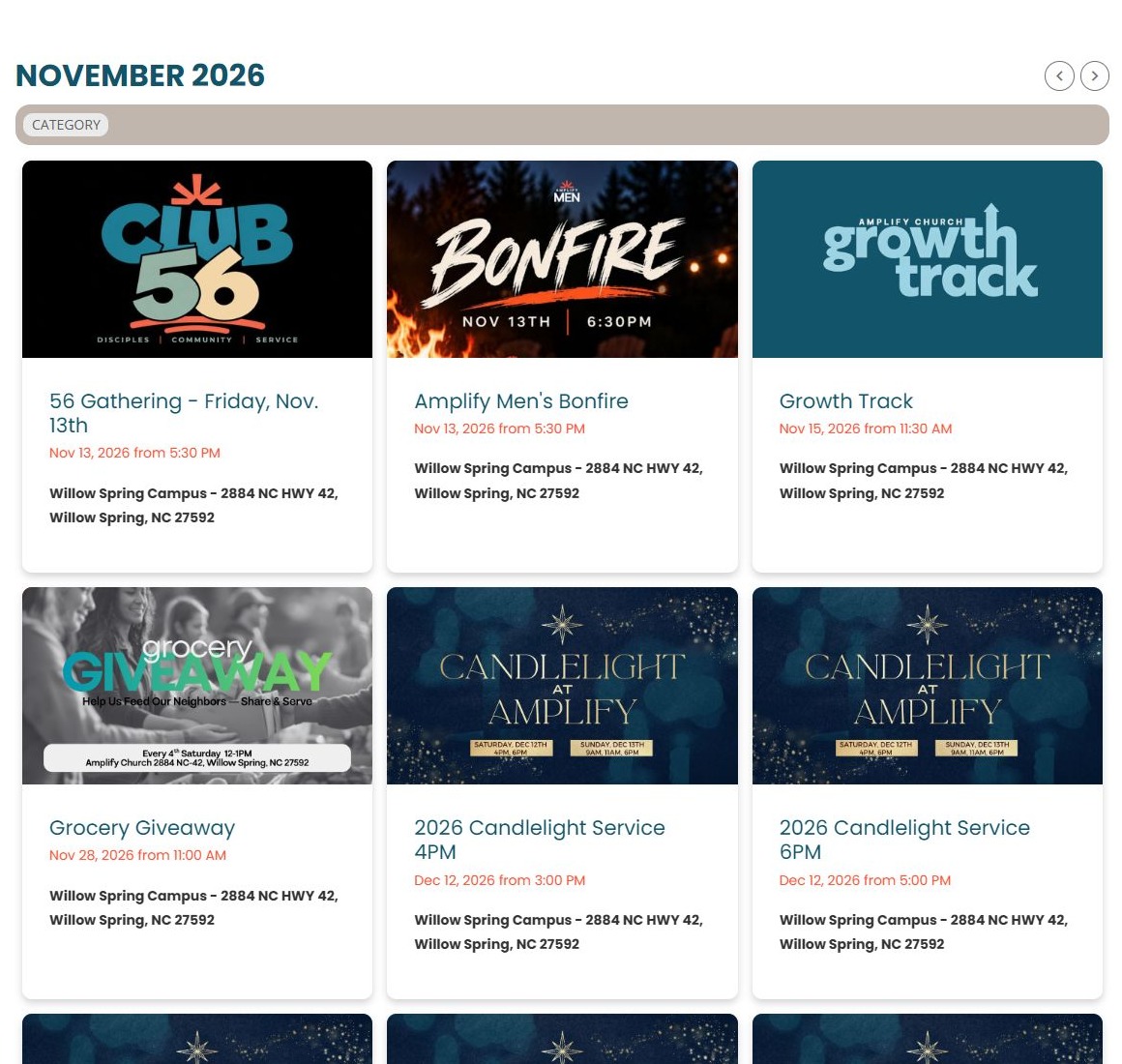
A calendar can be functional and still belong visually to the church website around it. Amplify Church in Willow Spring, North Carolina, carries its teal and orange palette into a Display.Church grid on its events page, pairing familiar colors with event artwork and written details.
Carry your visual identity into the calendar
Below the page’s photographic introduction, the desktop calendar presents three columns of event cards. Teal headings and orange date text connect the event presentation to the church’s wider visual identity.
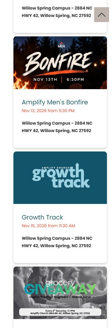
The artwork varies with the activity, while the cards keep a consistent structure. Each combines an image, title, date information and campus location. This gives ministry graphics room to differ without making visitors learn a new layout for every event.
Keep browsing controls close to the events
A month heading, navigation arrows and a category control are visible above the grid. Together they place the calendar’s browsing tools near the information they relate to. Their position keeps the browsing controls together above the event list.
That distinction is useful when reviewing any website example. When choosing a calendar layout for your own site, consider how someone will find another month or narrow a busy list. Keep control labels clear and check the complete browsing experience on your page.
Give visitors a consistent next step
Observed event links point to Amplify’s Church Center calendar pages. The website therefore provides an events browsing experience with a recognizable destination for visitors who want to continue. The link destination does not, by itself, confirm the backend integration settings.
In the genuine phone capture, the cards stack into one column and retain their written details. The idea to borrow is to combine familiar colors, a predictable card structure and clear onward links. Compare the written details with the artwork when updating events, so that both parts of the card communicate the same invitation.
Explore the Amplify Church website, or browse our calendar demos for ideas for your church.