Showcases > Lutheran Church of the Cross
Lutheran Church of the Cross

Client

Paul Finley
Senior Pastor
Do your church events have efficient, branded communication? That is, how easy is it for your people to find out what is happening and when? And how well does the presentation of this information align with your church’s branding?
We’d like to introduce you to Lutheran Church of the Cross (LCOTC). We hope this example will inspire you to evaluate and enhance your digital event communication displays.
Easy to find
Menu tab
People arriving to the Lutheran Church of the Cross (LCOTC) website do not need to look hard to find their events calendar. The menu at the top of their site webpages includes a Calendar tab.

Header Menu Tab
On the Homepage
If you scroll down the homepage, you will find a Display.Church Weekly Calendar template. This gives viewers a ‘week at a glance’ picture of what’s happening at LCOTC. Viewers can scroll back and forth between weeks to find upcoming and past events.
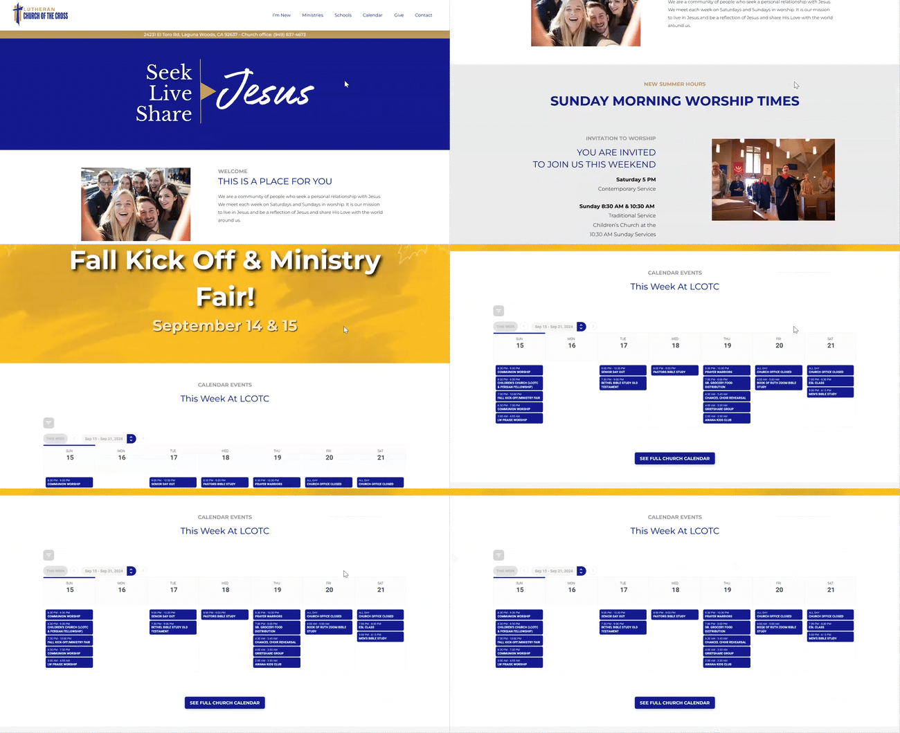
Scroll down the homepage
If you click on an event, you see a popup with more information. The information displayed is up to you.
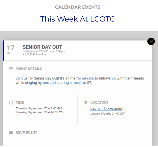
Info popup
Lots of Buttons
If you move around on the LCOTC site, you will notice SEE FULL CHURCH CALENDAR buttons everywhere. You can’t miss them!

Click for Full Church Calendar
Just the information they need
Let’s take a look at their calendar page.
The first thing we see is a picture of a calendar, so we know we got to the right place. Then, there is a short explanation of the church’s calendar options. This is nice because it tells people that what they are seeing is what there is. No need to go hunting around the website for more calendars. Then, we learn what we should do if we have questions or need more information plus a handy email link.
Following this intro, we have a repeat of the Display. Church Weekly Calendar which we saw on the homepage. This might be enough for some.
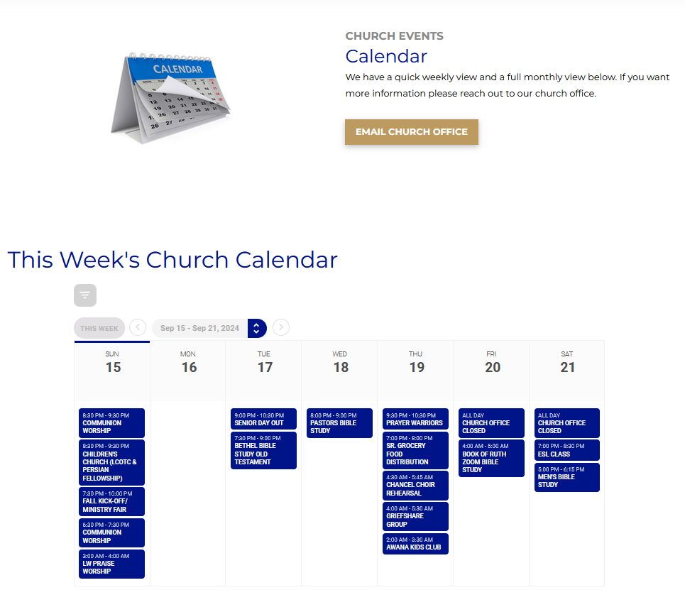
Weekly view
Right under the weekly view is a Display.Church Monthly Calendar for those who would like to see a fuller picture. Note the arrows after the 2024. Viewers can scroll back to past months and forward to future ones. As in the weekly calendar, clicking on an event shows a popup of more information.
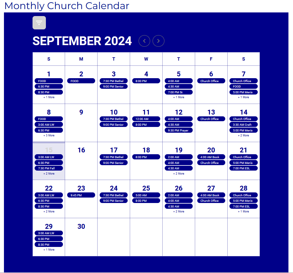
Monthly view
Viewers can use whichever calendar best suits their needs.
Cohesive church branding
This is the LCOTC logo. Pay attention to the colors (gold and blue).

LCOTC logo
Now, scroll up this page. Notice the colors in the images and gif. Same, right? This is a superb example of cohesive church branding.
Even though our message is about the Lord, we are still ‘selling’. We know it sounds strange sometimes, but today, successful churches understand the need to use marketing strategies. Cohesive, church branding is one of them.
Benefits of cohesive church branding
Coordinated and consistent branding lends your church a more professional and organized appearance, establishing trust and reliability.
Additionally, it enhances instant recognition. When your branding is cohesive, people can immediately identify your organization, even without seeing the name, as “Oh yes, that’s LCOTC.”
Easy to brand with Display.Church
You can customize almost every Display.Church item or feature. You decide characteristics such as the font, size, color, and position. That’s what LCOTC did. Their calendars use the same blue as their logo.
Display.Church also has specific branding options. If you use our hosted web page option, you can display your church icon or logo at the top of the page. You can also use additional branding options to set your brand and accent webpage colors. Read more about specific branding here.
Put it all together…
LCOTC website viewers can easily find the information they need. Since people can choose between weekly and monthly views, they are not overwhelmed with unneeded details. The coordinated and consistent branding gives a professional, ‘got it together’ feel and is also pleasing on the eye.
Client

Paul Finley
Senior Pastor


