At Display.Church, we work hard to make it possible for you to customize our products in almost any way you like. In other words, brand your calendar, group widget, event alert, and sign-up forms views by yourselves. No need to hire additional web developers or outside graphics people.
What was the request?
Rick Stawarz wanted to be able to change the position of the call-to-action (CTA) button in the main calendar view. The only option was centered. Rick wanted to have it aligned left.
Rick’s feedback
What was the improvement?
Please note: This improvement applies to the main views (not the event details views) of the following Display.Church calendar templates: Cards (Grid), Cards (List), and Slider.
You can now align the CTA button left, center, or right. Here is an example with Cards (Grid):
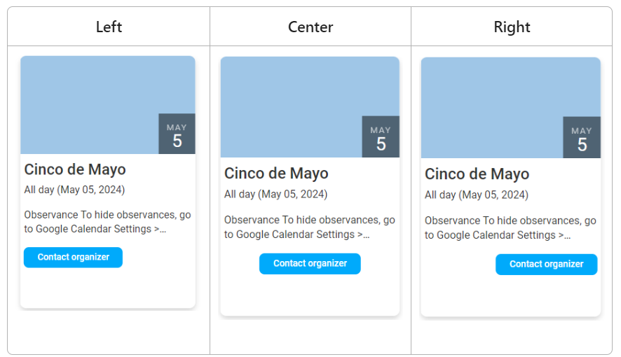
CTA button positions
In addition, in some views, you also have an option to expand the length of the CTA button to fill the full button space.
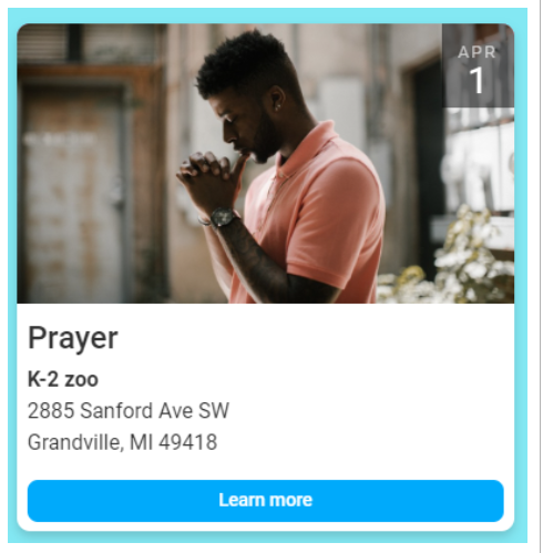
Expanded button length
We think that this simple but highly effective change will improve your design options, enabling you to more easily get the settings you prefer.
Read more about CTA buttons here:
calendar, Cards (Grid), Cards (List), Design, Display, Slider
