We’re excited to introduce a significant improvement to our event display features. Previously, our system incorporated accent colors from compatible integrations like Google Calendar, PCO, and Breeze. However, you could only see these colors when special hover effects were activated. Now, we’ve expanded this functionality to offer more flexibility and visual clarity.
What’s new?
With our latest update, you can now choose to display these accent colors permanently, even without hover effects. This means you can enjoy color-coded event grouping at a glance, making it easier to distinguish between different calendars or event types. Whether you prefer the dynamic hover effects or a more static display, you have full control over how to present your events.
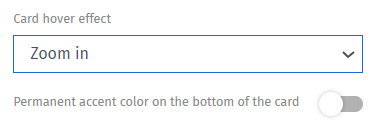
Specifically, if you choose None or Zoom in, you can permanently display your accent color at the bottom of the events. Just toggle on the Permanent accent color on the bottom of the card button. It will turn blue.

Just toggle on the Permanent option
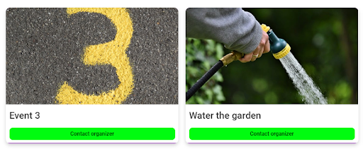
Here’s how it displays:

Notice the purple line at the bottom of the event listings in the image above.
Benefits
This enhancement complements our existing features, including the card effect with matching calendar accent colors and various hover effect options. It’s designed to work seamlessly with different display effects, ensuring that your events are organized and visually distinct, regardless of your chosen view.
By offering this permanent accent color option, we’ve made it even easier to manage and visualize multiple calendars or event categories, enhancing your overall scheduling experience.
calendar, Design, Display

